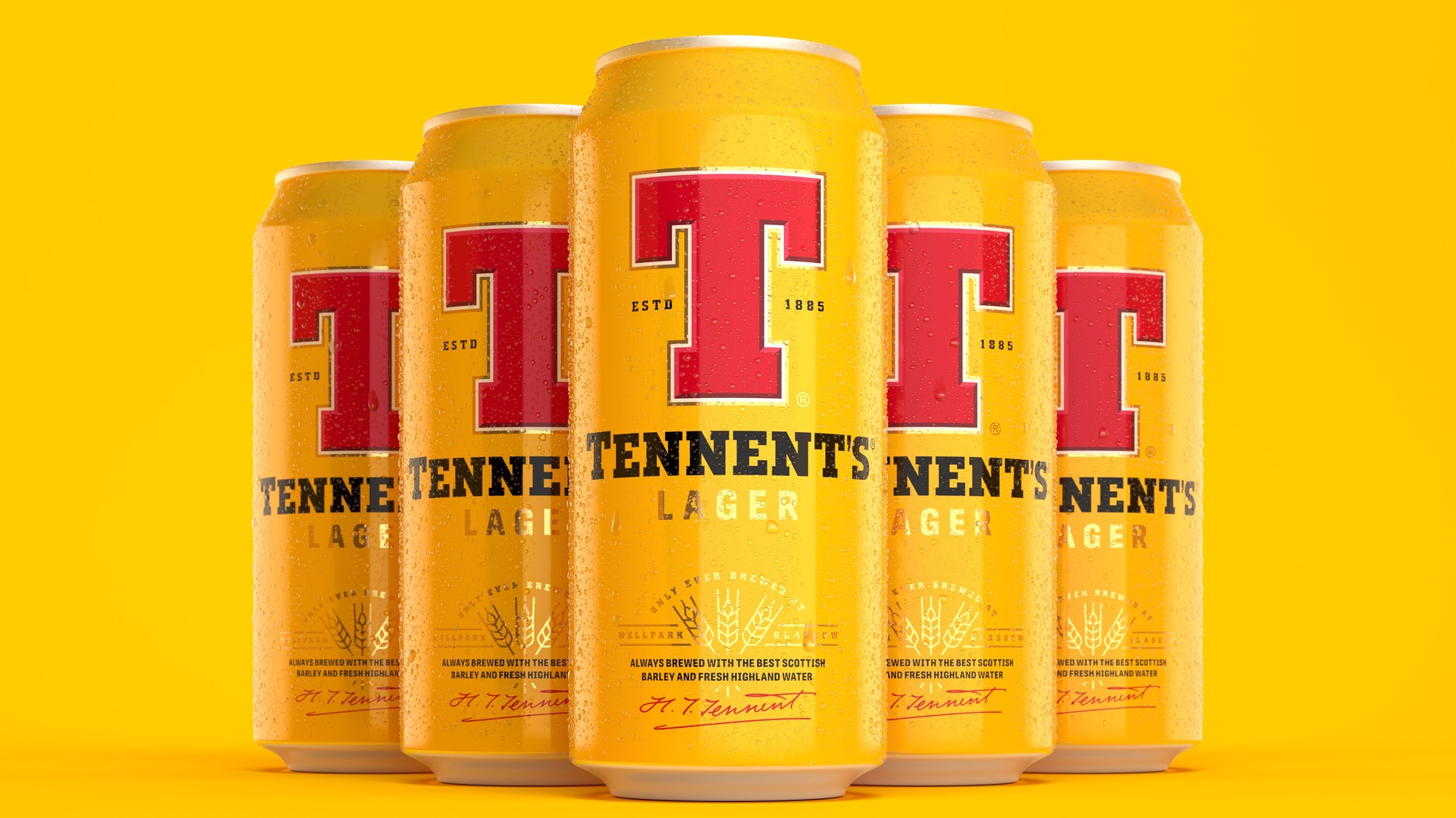
Tennent’s has revealed a new design for its lager cans for the first time in five years.
The Scottish brewer has revealed a new-look can which bosses say reflects the brand’s heritage “in a way that would stand out for now and years to come.”
The drinks giant joined forces with creative firm Thirst to create a new brand identity – building on Wellpark Brewery’s history as one of Scotland’s oldest businesses and the founder of Scotland’s original pilsner, which has been brewed on the site since 1885.
The Thirst team – led by executive Creative Director, Matt Burns – sought to “reflect the pride and quality of the brand” in the new design while still featuring Tennent’s traditional colour palette and red T.
 StoryShop
Matt said: “This project is a dream come true. There’s so much passion for the brand – from our team, from the Tennent’s team, and from everyone in Scotland. We poured all of that into the design.
“It was essential we put the heart that goes into Tennent’s Lager onto the can. We re-visited the beloved iconography, adding depth and richness, and introduced new markers to tell the story of the quality and skill that bring the lager to life and re-energise the brand.
“Scots are known for their optimistic outlook and the brand has always leveraged that energy to create uplifting, meaningful brand conversations. We set out to celebrate and amplify the position that Tennent’s represents in Scottish culture and beyond.”
The design team dug into how Tennent’s operates as a brewery to create the new brand identity.

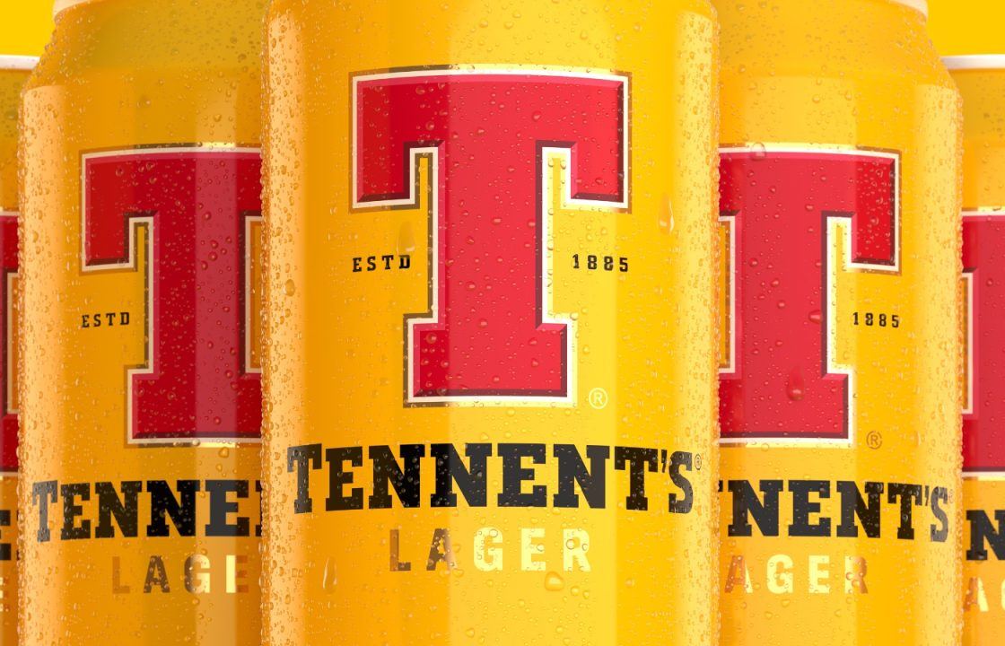
The existing keylines round the ‘T’ have been embellished with a bevelled detail to add depth and craft, helping it stand out.
A new barley motif tells the story of the locally sourced ingredients detailed on the can as: “Fresh Highland water, barley from local Scottish farmers and the perfect balance for herkules hops.”
The new-look Tennent’s Lager will roll out throughout Scotland and beyond in the coming days across the brand’s full packaged range.
This coincides with the launch of Tennent’s wider brand world, including limited edition glassware featuring illustrations by Tobias Hall.
The launch of the new BVI coincides with the launch of Tennent’s biggest marketing drive in eight years, which includes a through the line campaign featuring a brand-new TV commercial, out-of-home advertising and social media campaign.
This is the first piece of work under the brand’s exciting new platform ‘Raised in Scotland’ which will guide the brand for years to come.
Paul Menzies, C&C’s Brand and Marketing Director (Beer), said: “Tennent’s Lager is one of Scotland’s most important and enduring brands. When approaching an evolution of its visual identity, we wanted to respect that history and heritage whilst looking to embrace more current trends and design elements.
“Thirst creates design and branding that goes beyond the aesthetic into what the brand really means to people. A lot of work goes into delivering that and it’s reflected in the output. Over and above this, the team were a pleasure to work with throughout and sought to collaborate in a spirit that does justice to our brand icon.
“This is not so much a revolution, but an evolution, and everything that is immediately recognised about Tennent’s Lager is still featured within the packaging and design. We want to make the arrival of a new Tennent’s Lager can an event to get people talking.”
Follow STV News on WhatsApp
Scan the QR code on your mobile device for all the latest news from around the country